Preparation for deciding where to book a holiday in 1987 – we make a raid of High Street travel agencies, returning home with armloads full of glossy brochures featuring images of ‘idyllic hidden gems’ whose colours are so over saturated we need sunglasses to be able to look at them without risking blindness.
There were health warnings on travel brochures in the 70s and 80s which warned ‘don’t look at these if you’ve taken LSD.’
They drove me mad. We were Greek Island groupies at the time. Have you ever been to a Greek Island in spring/summer? The colour of the sea is such it has you dropping to your knees to sob at its pureness. Then you raise your head to see a sky so intensely blue you suspect that if there is some sort of celestial being up there, they must be a master at using Photoshop. Despite seeing more cerulean skies than we can count over the years, in various destinations, we still use the term ‘Greek sky’ when we’re under a particularly blue one.
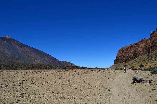
The light and colour in some of these destinations is so razor sharp and vibrant, any attempt to ramp it up too much is unnecessary. What’s more, there’s a danger of creating a fiction.
In a way I view some of the HD (high definition) used in travel photography as the modern day and more sophisticated successor to those oh-so-colourful photographs in holiday brochures.
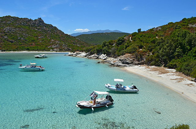
I like to look at good HD photographs. I also enjoy cleverly stylised Instagram images. But when I see either used to promote a destination I feel a wee bit uneasy about it.
They might be admirable examples of a talented photographer with excellent post-processing skills, and worthy of being exhibited as photographic art. I’m in awe of the skills of photographers who produce eye-catching HD images. But when used to ‘sell’ a destination, these types of images could be viewed as being deceptive.
There are many times I’ve been attracted to a place because a photograph has made me want to be in exactly the same spot the photographer had stood when they took the photo. It’s something I try to achieve myself when taking photos; looking for a scene which would make someone else want to be there.
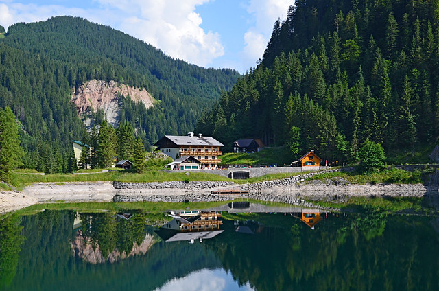
To be completely honest in photographic terms, once anyone who’s seen the photo is actually standing in that same spot, the view should look the same to them as it does in the image. Obviously if I take a shot of a sweeping vista on a sunny day and someone gazes over said sweeping vista when it’s chucking it down, that’s not going to happen. But I’m sure you get the principle.
There is an obligation to keep it real.
Over-stylising a photo might reward with immensely satisfying results for a photographer, but when used to promote a destination it can also raise unrealistic expectations amongst those viewing it.
However, there are ways to keep it real and be imaginative, even a tad more abstract. One is using an image to evoke the feel of a destination.
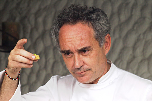
A few years ago we were fortunate to experience alchemy from master culinary magician Ferran Adriá. A pastel he created, little larger than a sugar lump, released wave after wave of flavours in the mouth. It was an edible summer’s tale, conjuring up childhood memories of dipping my toes in the sea and building sandcastles on the beach.
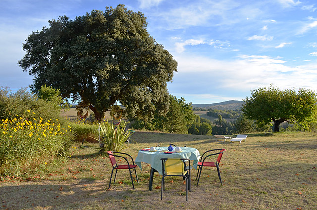
Photographs can do something similar by capturing the feel of a place rather than simply show how it looks. Images which reveal a destination’s personality by focussing on something small, something quirky, a feature which hints at more than what’s just shown in the image. It’s not easy. I continually strive to frame a shot which might suggest some of the unique elements of the character of any location we visit. But it’s a challenging and steep path which never ends.
Images of this ilk allow more satisfyingly creative leeway, and even self indulgence, but the important thing is they don’t lie to whoever may be looking at them, possibly even imagining themselves in the scene.
Jack is co-editor, writer and photographer for BuzzTrips and the Real Tenerife series of travel websites as well as a contributor to online travel sites and travel magazines. Follow Jack on Google+


Be the first to comment